Consumers often let their senses take control when they shop. Certain elements of advertising including packaging design and colour can imminently influence their purchase decisions. Aside from scent, touch and visual sensory are the two most common senses people subconsciously use when they shop.
Of course, e-commerce shopping makes it impossible to physically touch an object before it’s been purchased, many customers often comment on how bulky or small an item they ordered online is compared to their expectations during the initial purchase.
When it comes to product packaging design, there are a few important factors that you always need to take into consideration to ensure that you’re making the most fitting decision for your brand, target audience, and specific product.
What to Consider when Choosing Custom-Printed Packaging Colours
Your Target Audience
Package design and colours are two elements that speak volumes about your brand’s identity, creativity levels, and the product itself. Colours have the ability to evoke certain emotions and reactions from people depending on their associations and even personal experiences. While it’s impossible to anticipate every single customer’s reaction to your package design choices, it’s important to know who your target audience is.
Your Brand Logo, Messaging, and the Product Itself
What message are you trying to convey to your customers or prospective customers with your custom-printed packaging design? People generally shop with their eyes first. Whether your product is featured in a brick-and-mortar store, online store, or both, the packaging should clearly indicate what the product is, what it’s used for, and what it does.
All of these elements should work in alignment with your overall brand image and be easily discernable at first glance. Make sure your brand logo is clearly visible without being too overwhelming, so that your customers know what your company is called. There’s nothing more frustrating for consumers than coming across product packaging designs that are so intricate that they give little to no indication as to what the product actually is.
Colour Associations and What They Mean
Every colour on the spectrum has specific connotations and can have different associations for each person. When choosing a colour scheme for your product packaging design, it’s important to keep this in mind, so that you can make sure you’re conveying the right message to your customers.
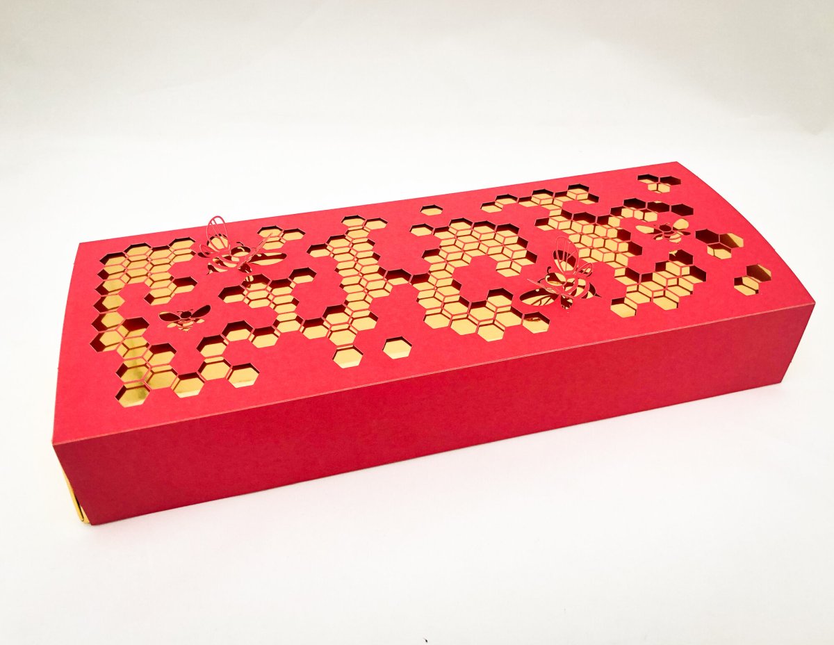
- Black. Sleek black packaging with either a glossy or matte finish typically gives off an air of luxury and elegance. When paired with classic gold or even red cursive writing, black can induce a beckoning, authoritative nature that easily attracts well-heeled customers.
- White. A white backdrop coupled with bold black writing or imagery also exudes a sense of elegance. But it also renders a clean, simple, and straightforward design that tells the customer everything they need to know about your product and brand as a whole.
- Pink. A soft pink or rose colour generates a romantic and feminine vibe, which is ideal for perfume bottles, bath products, and other similar items.
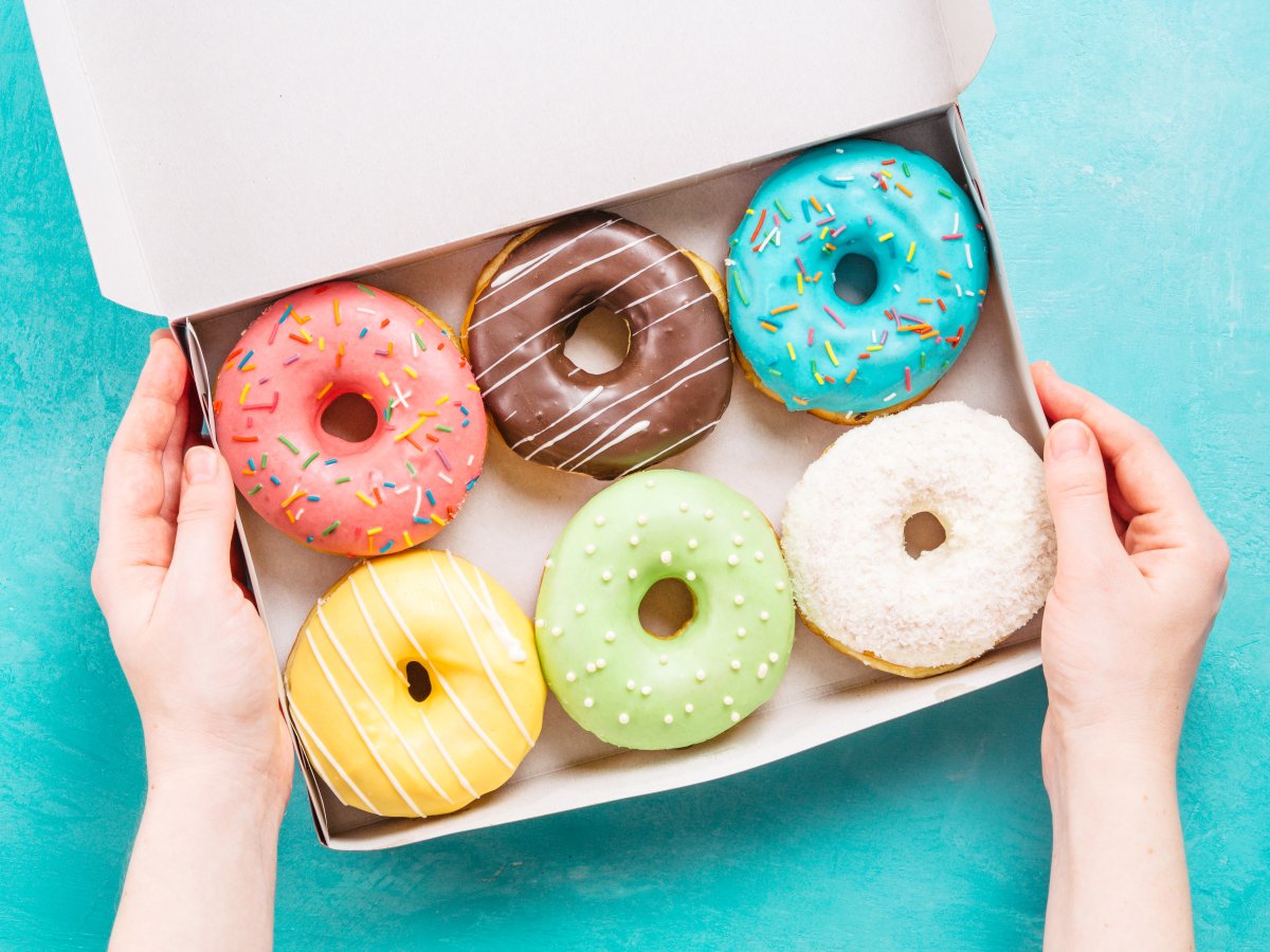
- Red. Most people associate a deep crimson red colour with strong romantic passion and sophistication. That’s why a lot of Valentine’s Day products like boxed chocolate and other desserts usually come in dark red packaging.
- Blue. Depending on the shade, blue can have a few different meanings. Indigo blue can have a serene and harmonious feel to it, whereas a light or baby blue often indicates that a product is for male infants. Shades of dark blue indicate a sense of sophistication and professionalism, whereas lighter shades of blue tend to be more fun and lighthearted.
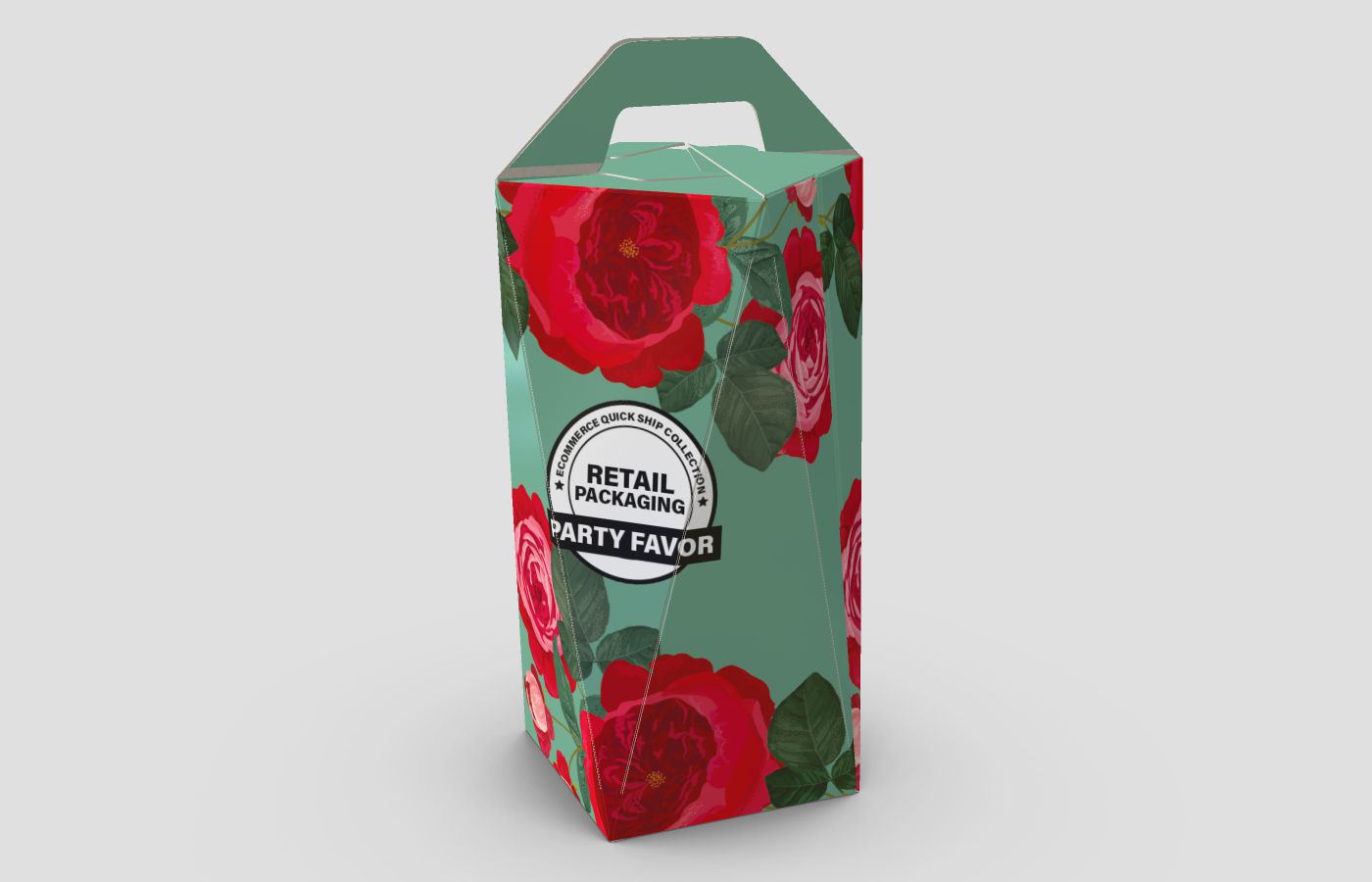
- Green. Often associated with all-natural, organic, or environmentally friendly products, green has very earthy connotations. In fact, the word green itself has even become synonymous with eco-friendly initiatives and sustainable health products over the years. Perhaps it has something to do with the fact that green is a common colour in the natural world that evokes the same feelings of serenity when we’re surrounded by nature.
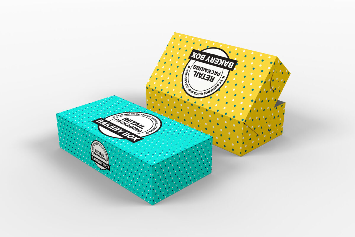
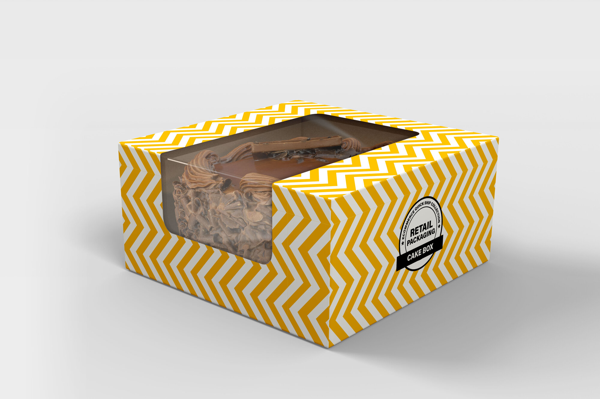
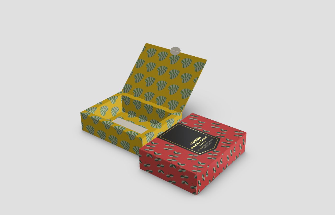
- Yellow. Yellow is a very cheery, uplifting, and positive colour that invokes creativity, lightheartedness, and general merriment. It’s also been known to stimulate the decision-making process for a lot of people, making it an ideal packaging choice for virtually any niche-market business. Yellow pulls indecisive customers in and encourages them to easily jump off the fence when deciding whether or not to purchase your product.
- Orange. Orange makes people feel optimistic, and self-confident. It serves as a great reminder of a beautiful sunset, sunrise, and other serene scenes from nature. A combination of yellow and red, many people find solace in orange because it brings out their boisterous nature while also soothing and igniting a strong passion within them at the same time.
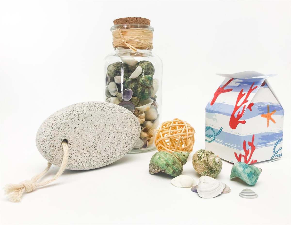
How Custom-Printed Product Packaging Design, Colours, and Shapes Influence Customer Perceptions of Your Brand
Value Perceptions
Value perceptions are the perceived values customers have of your brand, product, and service. This is a pre-judgement that they make in the back of their heads before purchasing your product or service.
Product packaging is the first impression many customers have of your brand—so make it count. If customers aren’t immediately enticed by your product packaging, then they’ll likely ignore it, or it will just get lost in the endless barrage of similar products.
Ease of Handling
Live streaming while unboxing a new product has become a prominent online trend, especially amongst social media influencers. Packaging should be easy to handle and open in relation to the product inside. It should also be lightweight and not awkwardly shaped, so that most people can lift it up with ease.
Masculine vs. Feminine Appearance
Again, this comes down to knowing your target audience well. Masculine packaging designs tend to feature more pointed sharp angles and edges as well as bold colour schemes. Stereotypically feminine packaging designs usually have rounded corners, delicate features, and bright colour patterns.
Magenta Depot’s Custom-Printed Packaging Designs
Whether you need help designing a custom-printed package for your product, or you already have a package design in mind, Magenta Depot can help you bring your vision to life at a very affordable rate.
We provide high-quality and beautifully designed custom-printed packaging for a variety of businesses across Ontario. Since all of our products are printed and manufactured right here in Canada, we guarantee a fast turnaround rate on all orders. Choose from a number of packaging style templates and colours on our website or upload your own designs! Contact us today to learn more about our services.